
Finding Save for Later
This project began as a personal endeavor. As a customer of the app and a UX design student seeking a challenge, I decided to apply my learning and validate my assumptions.
I wrote and published a UX case study proposing a solution based on user testing of the Enjoei app. After a year, the company discovered this case study online and offered me a job.
During my tenure, I worked on various projects, including validating this case study with A/B testing, which exhibited a 25% increase in the findability of a feature for new users.
This project started as a personal project. As a customer of the app and a UX designer student looking for a challenge, I decided to put in practice my learnings and validate my assumption.
I've proposed a solution based on user testing to improve the user experience of the Enjoei app.
The company has found this case study online, after a year, and offered me a job.
During my time there, I could work on different projects, including validating this case study with an A/B testing.
UX Designer
Enjoei
2019
iOS & Android

The problem
New users couldn’t find the right way to save a product
Users didn’t know where the saved product was
The goal
Put into practice my learnings as a beginner UX Designer
Improve the findability of the 'save for later' button

Discover
Guerrilla usability test
What: Enjoei IOS app
Who: Potential users, such as people that buy products online and smartphone users.
Where: Cultural Center in São Paulo
Why: To validate the issues I had while navigating through Enjoei’s app
Scenarios
T1. You only have R$50,00 to buy a coat for yourself. What do you do?
T2. You see a coat you might like, but you’re not sure about something on it. How would you clarify your question?
T3. You really like the coat but want to leave it to buy another time. How would you do that?
T4. You just opened the app and want to find the coat that you liked. Where would you find it?

User testing day at the Cultural Center of São Paulo
I tested with 5 users that I approached in the Cultural Center of São Paulo and some friends. 2 of the 5 users had already used the app as sellers. The focused scope of the study allowed me to iterate through the design cycle with a small sample size.
Based on my assumptions, I used Job Stories to explore situations, associated motivations, and desired outcomes of users.

I grouped the issues I've found from the user's interviews and usability tests into four categories:

After gathering users' feedback, I decided to tackle all the pain points.
I assumed they would be both important to the users, as well for the company in conversion rate.
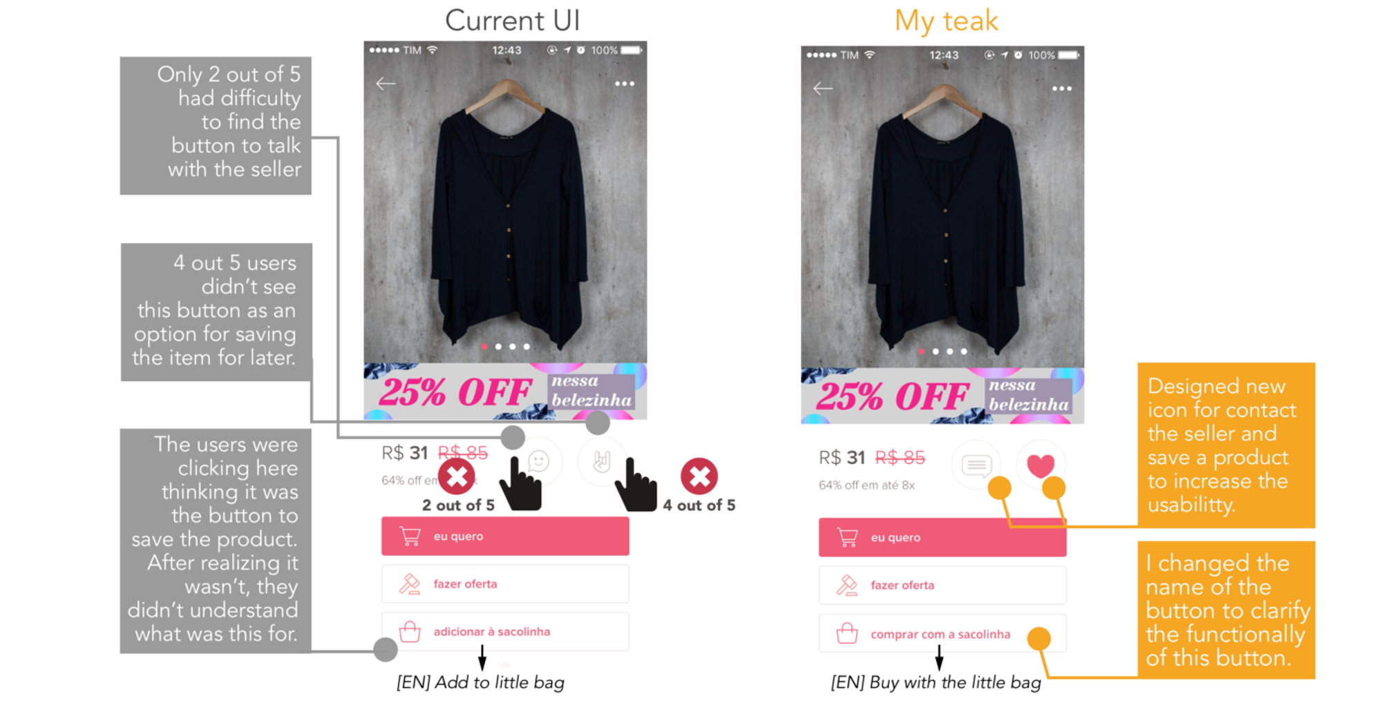
Pain Point #1: How to save a product

Users couldn’t find the right way to save a product and ended up clicking on another button related to a shopping cart (little bag button) from that specific seller
“Add to the little bag!” — User excited thinking she found a way to save the product.
Pain Point #2: Users didn’t know where the saved product
People assumed they have saved the item for later.
When questioned on scenario 4, to find the saved item, they didn’t know where it was and couldn’t complete the task.
“I don’t know where is my little bag” — User disappointed that she didn’t find the button for the little bag items (like a shopping cart).

Pain Point #3: How to contact the seller
Although only 2 out of 5 users had problems contacting the seller, I believed that a small adjustment on the icon could improve usability.
“I wasn’t sure what this smiling face button was for, I thought maybe it was a ’like’ button or to talk.” - After the user clicked on the button.

Pain Point #4: How to filter search results

The filter button only appears after the users start searching for a specific product.
“I’m trying to find something that limits the price.”
I analyzed users’ behavior and patterns related to the previous tasks in order to come up with solutions.
Sketching was a great way to organize my thoughts and brainstorm the ideas.
I came up with some ideas that could be possible solutions to the pain points.

Develop
Hi-Fi Mockups
After sketching, I felt ready to create a hi-fi version of a few of my proposed solutions.
Here’s a side-by-side look at the changes to solve the pain points related to contacting the seller and saving the product for later.
Tweaks related to trying to filter the product and find the item saved for later:

Deliver
User testing
6 users: 4 in person and 2 online, recording the screen
Through testing, I could see that one of my redesigns wasn’t performing as intended. The filter button on the search screen wasn’t the main interaction the user would go to first, instead, they clicked on the search bar and then used the filter button.

For ‘saving a product’ there was still some friction as 3 out of 6 users clicked on the “I want” button before going to the heart button.
With my tweak on the name of the “little bag “button, no one clicked there thinking it was to save the product. And users could successfully identify the function of the ‘contact the seller’.
They could immediately find the ‘saved product’ button on the menu.
Here is the success rate by task:

A/B Testing
When I got hired by the company, I planned an A/B for the 'save for later button.'
The test ran for 2 weeks:
For 20% of all users from the Web version
10% for each icon button

The buttons that were A/B tested: heart vs current
Results on the heart button:
+15,8% clicks overall
+ 25% clicks from new users
Around 40% of users buy a product after saving it for later, so with this tweak, the company could increase its conversion rate and improve the user experience, giving the signals that new users understand easily the heart icon.
Reflection
The funny and informal communication of the app sometimes impacts the user experience, for example, the creativity of the icons makes it difficult to understand at first
Using universal icons on the talk to the seller and save for later button could have a frictionless experience and the company could increase its revenue
With less than $5 I could validate those solutions in guerrilla usability tests (I bought a bonbon to prize users that accepted to participate in the test)
Shoutouts & Credits:
• Product manager & developers: for making the A/B test viable
• Data analyst: for tracking, and analyzing the results
• Luis Vilela: for believing in my work, reaching me out offering the opportunity when the company wasn't actually planning to hire a UX Designer
• My partner: for all the encouragement and feedback while I was working on this project
Let's get in touch
Feel free to reach out for collaborations or just a friendly hello 😄
llaravacco@gmail.comDesigned and built by Lais Lara Vacco in 2022 using Ycode.
Last updated Jan 2025.