Increasing the order value
Bunny Studio was a marketplace with pre-vetted freelancers for creative services with:
+15k businesses partners
+13k freelancers
+50 types of categories
5 languages in the platform
As a Product Designer and Product Manager of the Storefront squad, I was responsible for the conversion flow and I led this product. I worked close with a user researcher, data analysts, developers, customer experience team, marketing and operations.
[Dynamic page data - Case study intro text]
UX Designer and Product Manager
Bunny Studio
Q2 2022
Responsive web design

The problem
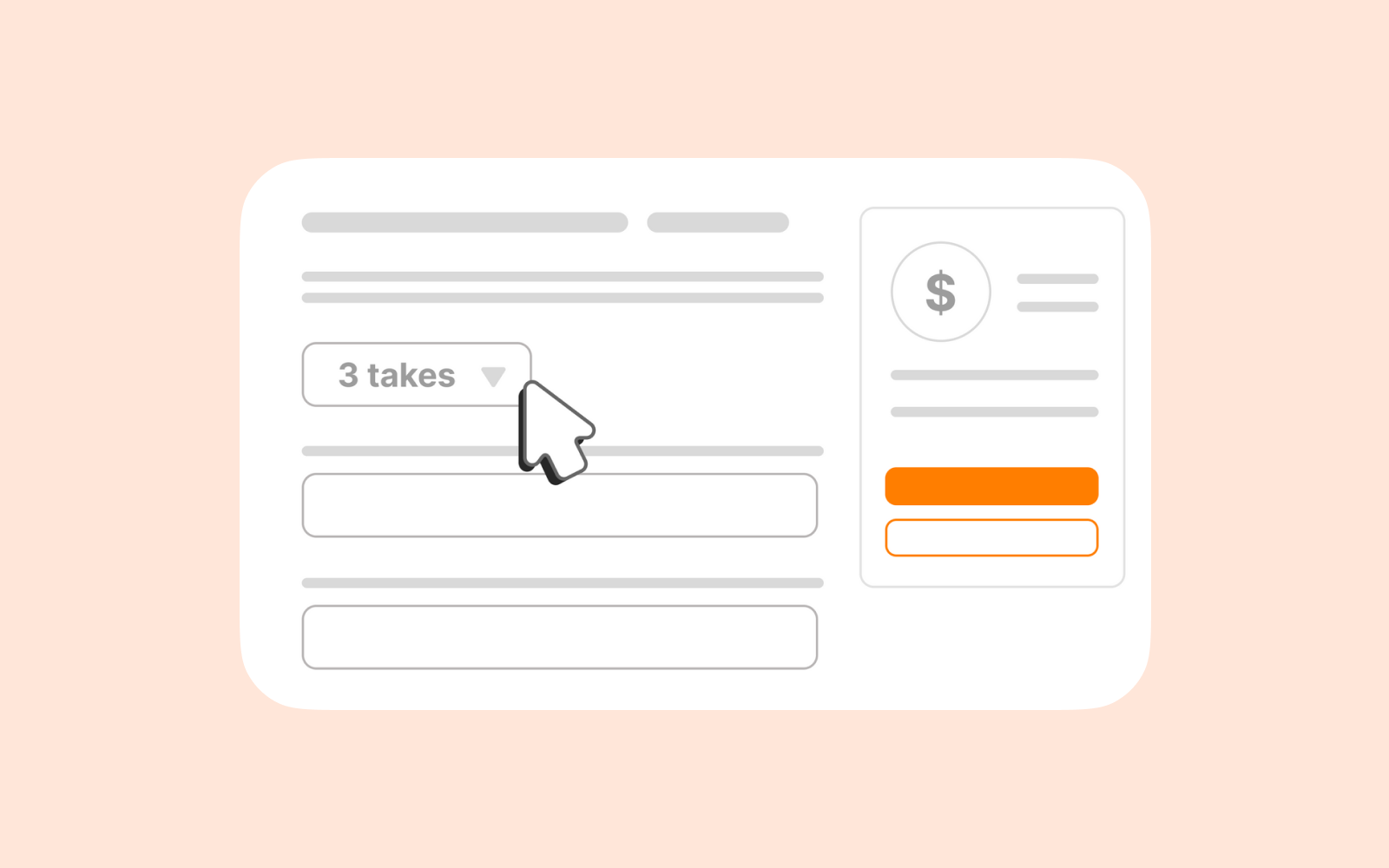
Friction and operational burden when users asked takes*.
*Takes are different ways a script can be recorded.
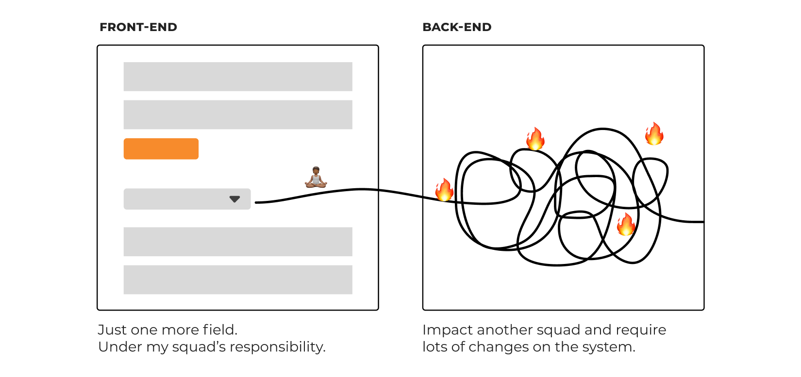
The main challenge of it was the platform was tied to a fulfillment flow.
So any change could be a big change in the system.
And there was a confusion with another functionality called ’parts’, which was related to 'takes'.
The goal
How can we offer takes as an small experiment?
⚒️ Create an MVP
💰 Test the pricing
🔍 Learn the workflow

RESEARCH
I've gathered insights from:
A survey with freelancers
Support team
Data team
Main insights
Clients found different workaround to request takes
~0.66% of projects had request for takes
Freelancers did not earn if they did not raise a flag
A pay raise of 10% to 50% was expected by freelancers when tasks were requested
2 or 3 takes was the most frequent request
8 takes was the maximum a client requested
No takes created more back-and-forth of revisions
DESIGN EXPLORATION
3 proposed solutions
My task was to create 3 alternatives of a user-friendly interface, each one with a trade-off.

I presented them to stakeholders and developers from my squad and the other one that could be impacted.
We discussed for a while the possibilities of the project and I listened carefully to their feedback and suggestions.
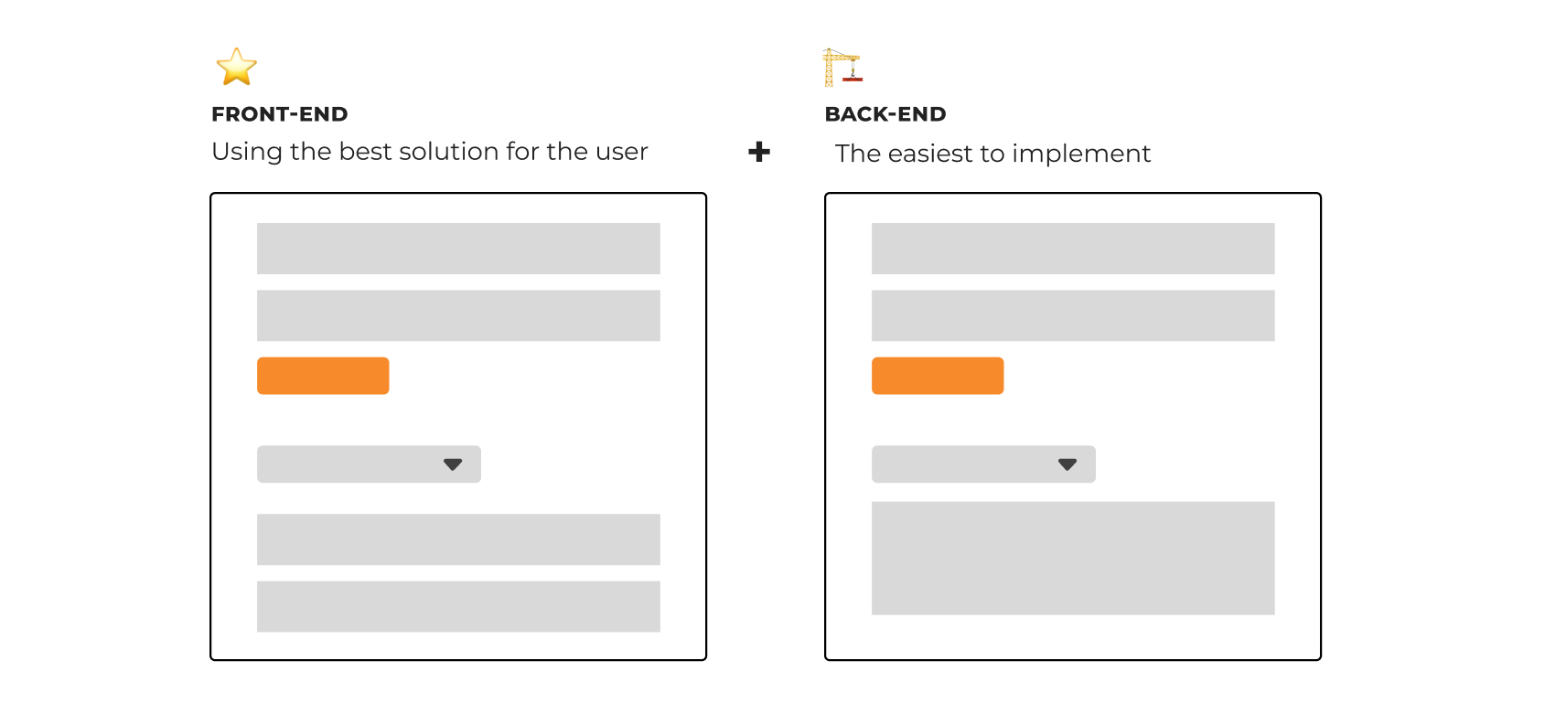
Basically, the best solution for the user experience, had a difficult implementation and would impact another squad.

I provided examples and explanations for why certain design decisions, and highlighted the best option for users.
The developers started to explored how to simplify the implementation, as we had a really tide deadline.
As a result of those efforts, and the team collaboration, at that meeting we were able found together an alternative that would service business and users.

RESULTS
Business and user impact
😍 Freelancers and ops
Freelancers were getting paid for the takes
We had less operational burden
➕ Projects
53% increase of projects with takes
compared to initial analysis
💰 Value increase
37% increase in average order value of a voice-over compared to projects without takes
“So, I’ve been looking into the projects. Clients seem to grasp the functionality pretty good!
Both New and Ongoing clients seem to be using the functionality without any issues."- CX coordinator
“Thank you. This is what we needed!” - A Freelancer
“This will be a big time saver, thank you for the feature.” - A client
REFLECTION
My learnings
🤝 Collaborate with developers and stakeholders early and often
🚀 Embrace constrains to find the most creative solution
Shoutouts & Credits
Marina UX Designer/Researcher: support the design process, and research.
Data & pricing team: defined the pricing, find and analyzed data, and created the dashboards to analyze the results.
Rodrigo CRM Specialist: for writing and sending announcement email to clients and freelancers.
Let's get in touch
Feel free to reach out for collaborations or just a friendly hello 😄
llaravacco@gmail.comDesigned and built by Lais Lara Vacco in 2022 using Ycode.
Last updated Jan 2025.
