Cash-out experience of PicPay
PicPay was one of the largest payment app in Brazil
+30M users
+3M places accepting it in Brazil
$380M in transactions monthly - in the cash out journey
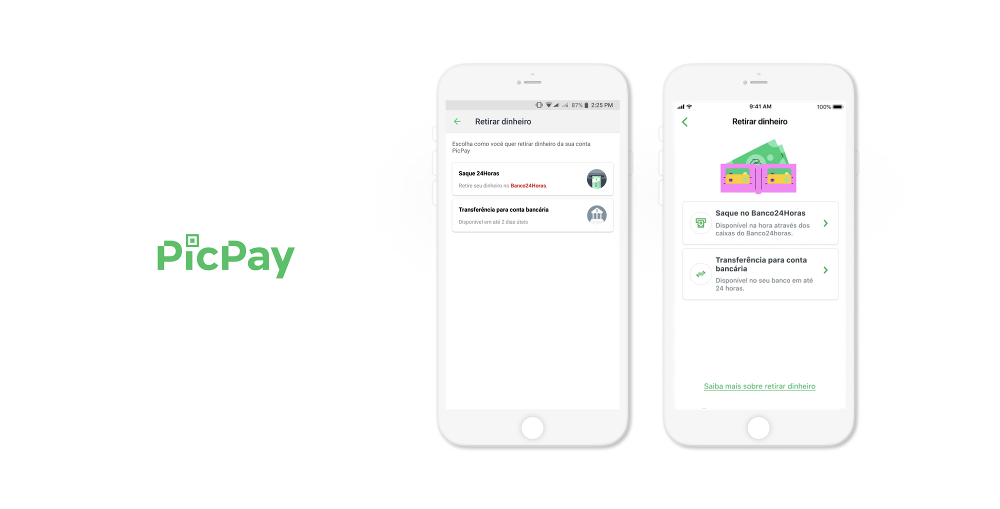
I joined Cash Out Squad as a Product Designer when the app partnered with the Brazilian government to provide emergency aid for low-income people during COVID. This led to a surge in users and withdrawals, exposing many flaws in the cash out flow. I prioritized the most urgent and impactful design projects and collaborated with project manager, developers and stakeholders.
This is a brief summary of how I tackled the challenges.
[Dynamic page data - Case study intro text]
Product Designer
PicPay
2020
iOS & Android

The problem
The app faced a sudden growth due to a government subsidy that provided emergency aid for low-income people during COVID.
This resulted in:
🚫A large number of users who could not withdraw or transfer money due to technical and user experience issues
📈 Around +USD $380K more withdrawals within 3 months
😕 Increased support tickets
🏦 New bank requirement (PIX) that confused users and limited their options
The goal
Tackle the major pain points to decrease tickets and improve UX
💬 Add specific and helpful error messages
🏦 Add new bank requirement to the cash-out journey
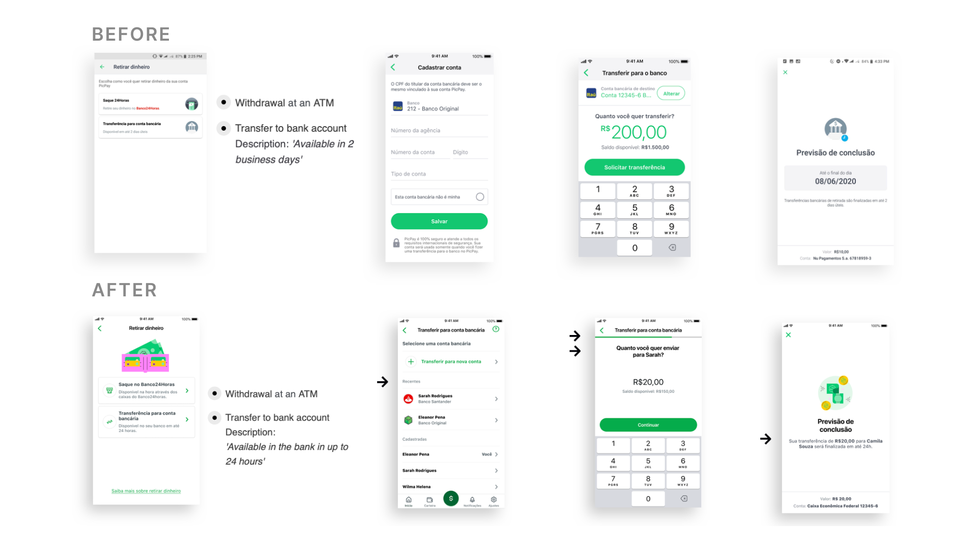
🎯 Create a new cash-out journey when transferring to another bank
📱 Add new UI to create a consistent experience across the wallet
RESEARCH
I collected data from:
Existing research
Customer Experience team
Mixpanel
Survey with heavy users
DEFINE
I did a service blueprint to visualize each step of the user journey and mapped the opportunities.
Then, I prioritized them based on their urgency and impact.

DESIGN EXPLORATION
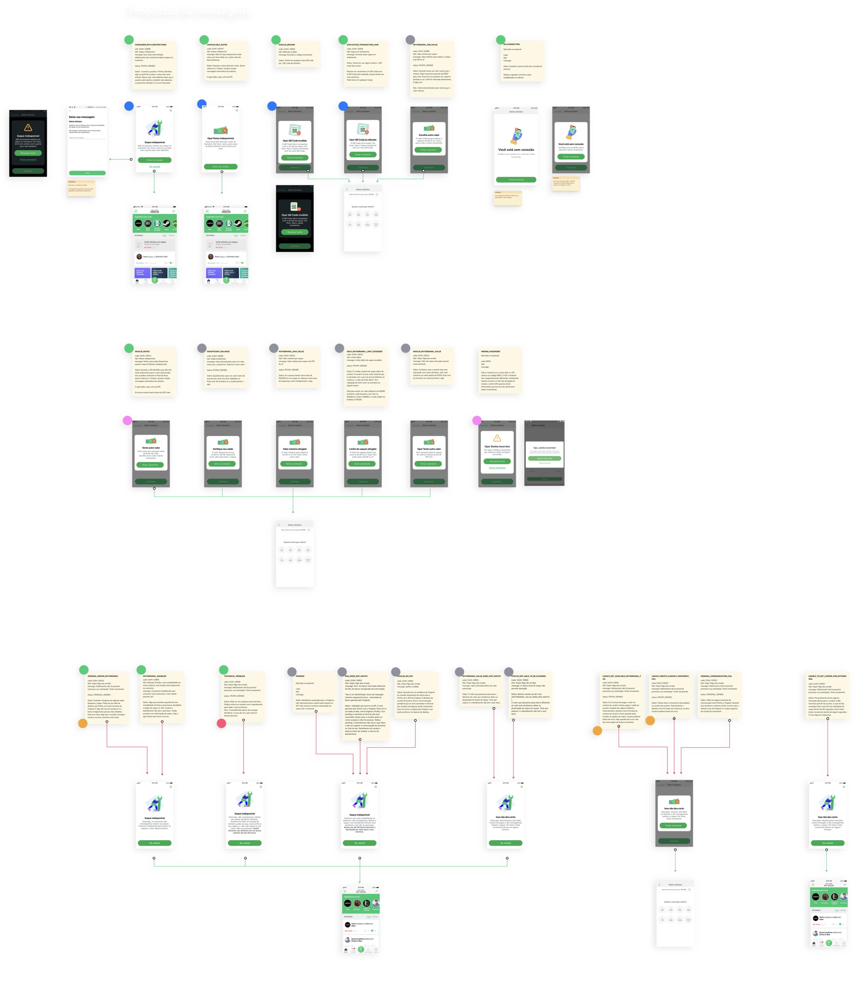
I found that the system had +20 technical errors, but the app only had 5 error messages.
My task was to create +20 user-friendly error messages, working closely with the developers.
I also explored some solutions for the pain points in the cash out flow of transferring to another bank account.
I validated these solutions with users later.
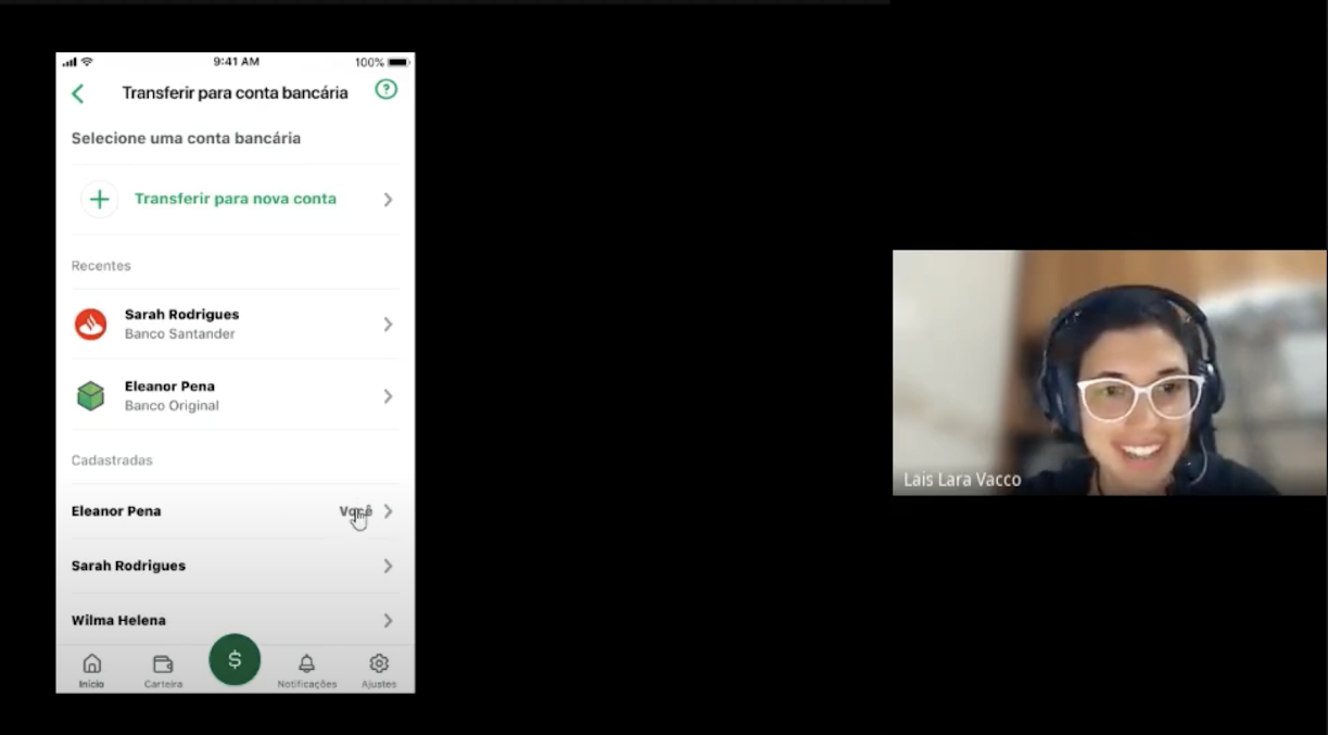
VALIDATION INSIGHTS
The validation revealed that users:
Were confused with the new bank requirement
Wanted to print their receipt
ITERATION
Based on the validation, I discovered an opportunity that was not previously mapped.
Users expected to find the new bank requirement in that funnel, but it was not available due to some limitations.
We could still suggest it as an alternative.
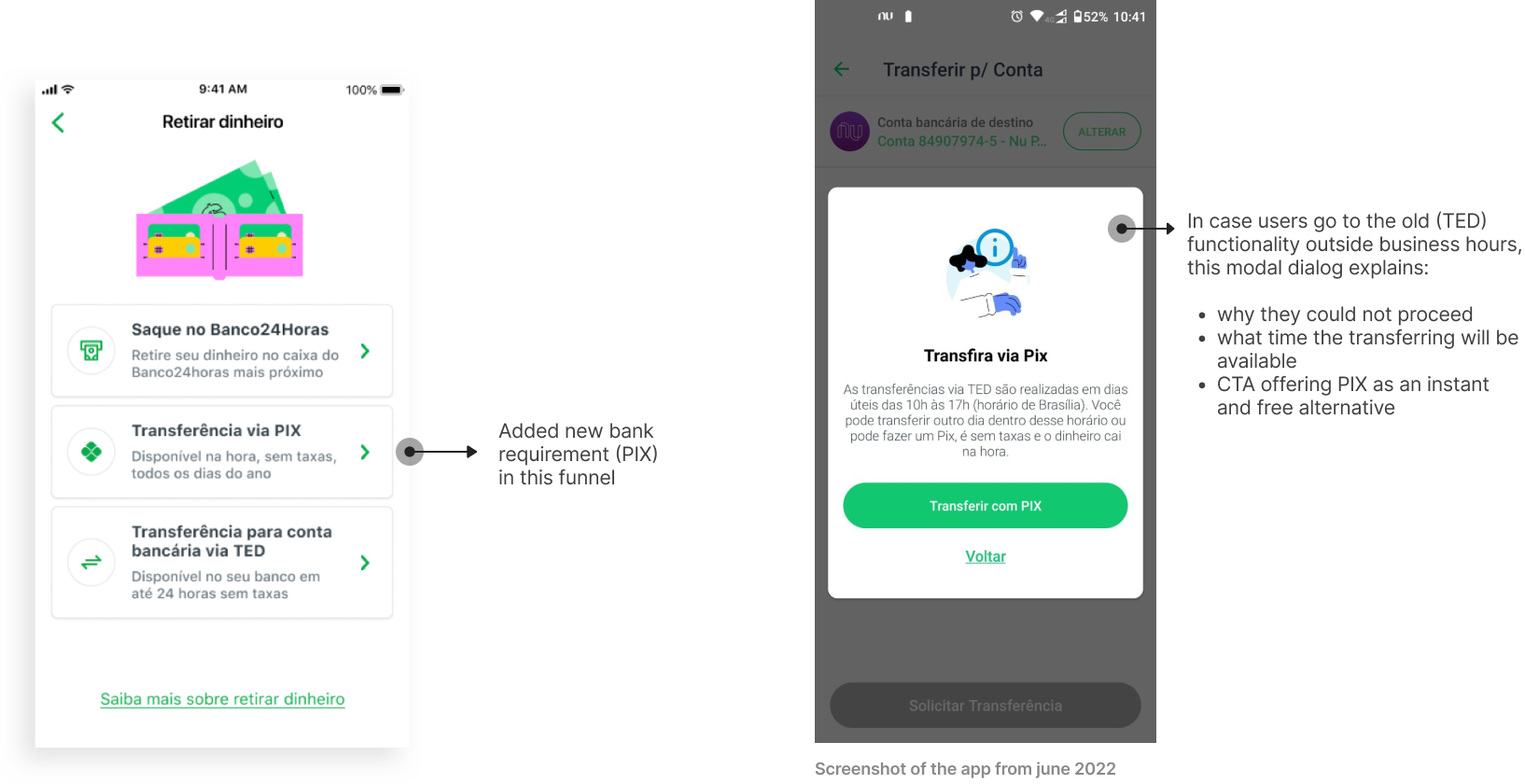
So, if users tried to use that functionality outside business hours, they would see a modal dialog that explained:
Why they could not proceed
What time the transfer would be available
A CTA offering the new bank function (PIX) as an instant and free alternative
This solution was prioritized over all other solutions, as it had a high impact given the context of the new bank requirement.
REFLECTION
🚧 Implement in small releases
✅ Validate early with users
🤝 Collaborate often with developers
Let's get in touch
Feel free to reach out for collaborations or just a friendly hello 😄
llaravacco@gmail.comDesigned and built by Lais Lara Vacco in 2022 using Ycode.
Last updated Jan 2025.
